Logo design is a critical aspect of branding, as it visually represents a company’s identity and values. A successful logo should be simple, memorable, and versatile, able to work across various platforms and sizes while maintaining its clarity and impact. It combines color, typography, and imagery in a way that reflects the brand’s personality, making it instantly recognizable to the audience. Whether using a symbol, wordmark, or combination, a good logo not only differentiates a business from competitors but also fosters trust and loyalty by creating a lasting visual connection with customers.
TYPE OF LOGO
There are five main types of logo designs, each serving different branding needs. Here’s an overview of these types:
1. Wordmark (Logotype):
- A logo made up of the brand’s name in a unique, stylized font.
- Example: Google, Coca-Cola.
- Best for: Companies with unique, short names or when the name itself is strong enough to stand alone.
2. Letter mark (Monogram):
- A logo that uses the initials or first letters of a company’s name.
- Example: IBM, NASA.
- Best for: Businesses with longer names or when initials are commonly recognized.
3. Icon (Symbol or Pictorial Mark):
- A graphical symbol that represents the brand without text.
- Example: Apple, Nike’s swoosh.
- Best for: Established brands that are easily recognizable by their symbol.
4. Combination Mark:
- Combines both text and a symbol or icon in one cohesive design.
- Example: Adidas, Burger King.
- Best for: Creating a clear, versatile logo with both text and imagery.
5. Emblem:
- A logo where the text is encased within a symbol, often resembling a badge or seal.
- Example: Starbucks, Harley-Davidson.
- Best for: Traditional, formal brands or those seeking a classic, authoritative look.
EMBLEM LOGO

ABOUT THIS DESIGN
This logo design represents “Niti Jain, Education Consultant” and features a sleek, modern look. The prominent initials “NJ” are creatively combined in a bold red, giving the design a dynamic and authoritative appearance. The use of red adds energy and confidence, while the curved elements soften the overall look, creating a balance between professionalism and approachability. The font used for the name and title below the initials is clean and minimalist, reflecting clarity and trustworthiness. The background, set in a professional office environment, enhances the logo’s representation of a serious, yet client-friendly consulting service. Overall, the design effectively communicates expertise and reliability in the education consulting field.
MONOGRAM LOGO
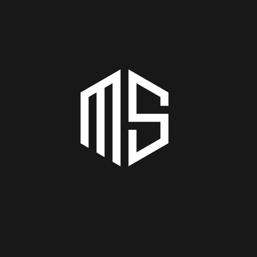
ABOUT THIS DESIGN
This logo design featuring the letters “MS” is modern and minimalistic, with bold, angular lines that create a clean and strong geometric shape. The monochromatic black and white color scheme enhances its simplicity and professionalism, making it versatile for a variety of branding materials. The interconnected letters form a cohesive design that represents unity and strength, perfect for a brand aiming to project a sleek and forward-thinking image.